Designing with a brand like BAPE is a dream for most sneaker collectors. Add in KidSuper and the FIFA World Cup, and it’s hard to imagine a bigger stage. Sneakerdenn, a close friend of ours, had been teasing the project for some time, but his involvement runs far deeper than many might expect. We sent him a few questions to find out how the collaboration came together, the significance behind each colourway, and what he hopes this opportunity leads to in the future.
After years spent documenting, researching, and collecting some of the rarest sneakers in the world, while also creating speculative sneaker concepts that captured the imagination of online communities, the KidSuper x BAPE World Cup project marks the first time one of his designs has officially entered production and been released to the public. More than just the collaboration, the project represents a major creative milestone… signalling Sneakerdenn’s evolution from collector, archivist, and storyteller into an official design collaborator on one of the biggest stages in sport and sneaker culture.

How did your involvement with the KidSuper x BAPE World Cup BAPESTA project begin, and what convinced you to contribute to the project?
I contributed to Bimma Williams’ ‘Collab of the year’ video where he randomly asked me to talk about Kidsuper’s collaboration with Bape last year. I posted the extract on my story and tagged kidsuper. That’s how we started chatting. Quickly, Colm mentioned he had a Bape World cup project in the works. I immediately thought I have to get involved, given the remarkable uniqueness of this opportunity: Bapesta project for a universal moment like the world cup, Kidsuper. it was a no brainer.
You developed a much larger range of concepts than the six that was selected to release. What was your creative starting point when designing the collection?
My creative starting point was doing in depth research on kit colors for each country. not just the jerseys, but the entire jersey-shorts-socks combo. I would always aim to identify the most common and typical colorblocking patterns for each country (as uniforms change often but classics keep coming back), and my aim was to transpose the most traditional kit look to a Bapesta, which is the perfect silhouette to experiment with simple blocking and fun colors.
How did you balance all the aspects of the design brief. From KidSuper , BAPE’s and the individual nations ?
There was no design brief, it was my own brief: it’s the world cup, the most relevant is to represent the teams who themselves represent their countries. i think that approach is pretty common sense for a pack of that nature.

What was it like working alongside the KidSuper and BAPE teams throughout the design process?
I didn’t work with Bape at all, it was all directly with Colm. We disagreed on a lot of stuff, and I always argumented my opinions as far as I could. Ultimately, it is his project and his calls. The fact that he picked 6 of my colorways and let me have an impact on certain aspects of the projects’ direction tell me he values my opinion, which is obviously great to know.
Of all the concepts you submitted, why do you think these six BAPESTA designs were chosen for the final World Cup pack?
It took a combination of Colm liking them, followed by Bape liking them too. I wouldn’t be able to say why those and not others, but I do appreciate how cool it is that I got my homecountry France, and Bape’s homecountry – Japan.
FRANCE
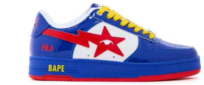
Built around the nation’s unmistakable blue identity, with gold accents nodding to France’s traditional FFF rooster emblem on the football shirt, the France colourway carries particular significance for SneakerDenn given his French roots. More than just a design choice, blue has been synonymous with French football for over a century. The nickname “Les Bleus” is woven into the fabric of the national team, drawing from the colours of the French Republic and becoming one of the most recognisable identities in world sport. Like many international football shirts, the colours are deeply rooted in national symbolism. In France, blue evolved into a cultural marker that transcends football, representing national pride, unity and heritage.
JAPAN
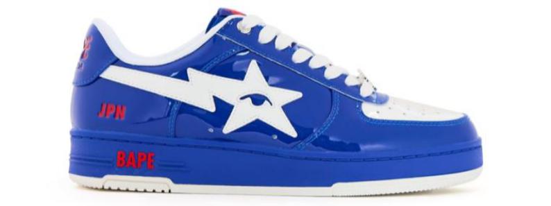
Although Japan’s flag is defined by its striking red on white, the nation’s football identity has, for generations, been represented by deep blue shirts accented with white and subtle flashes of red, a direction reflected in the final shoe. The shade, often referred to as Samurai Blue, emerged as the defining colour of Japanese football during the latter half of the twentieth century. Over time it became a symbol of discipline, unity and collective strength, qualities deeply associated with the national team. Japan’s football colours have evolved beyond the flag itself, becoming a distinct sporting identity recognised around the world.
URUGUAY
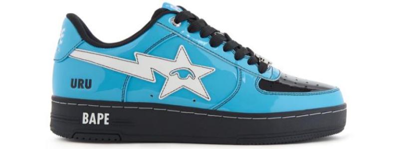
Centred around Uruguay’s iconic sky-blue identity, the colourway pairs the nation’s most recognisable football colour with bold black contrasts inspired by details that have appeared throughout Uruguay’s rich history. Uruguay’s relationship with sky blue runs deeper than football. The colour became associated with the national team in the early twentieth century following a famous victory over Argentina. The shirt eventually becoming one of the most revered symbols in world football. Known as “La Celeste” (“The Sky Blue”), Uruguay’s kit has remained remarkably consistent for more than a century, representing a nation whose footballing influence far outweighs its size.
SOUTH KOREA
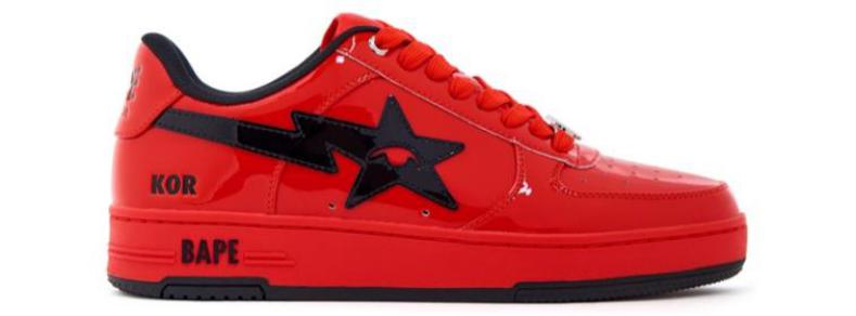
Reflecting the evolution of Korean football aesthetics over the last decade, this colourway moves beyond the traditional red-and-blue associations often linked to the national flag and earlier generations of kits, embracing the more aggressive red-and-black combinations that have become increasingly prominent in modern South Korean football. The national team’s nickname, the “Taeguk Warriors“, is rooted in the red symbol found on the national flag, while supporters have become globally recognised as the “Red Devils“, creating one of football’s most passionate and visually striking fan cultures. In recent years, however, Korean kit design has taken on a more contemporary direction. Designers have increasingly incorporated black detailing, tonal graphics and darker contrasts to create a sharper, more modern aesthetic. The combination of red and black brings added intensity and a hint of sophistication, reflecting the broader influence of Korean design, fashion and street culture.
AUSTRALIA
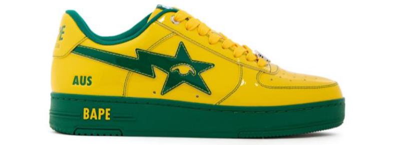
The combination of green and gold has represented Australian sport for more than a century, becoming a unifying symbol across disciplines ranging from football and rugby to cricket and athletics. The colours are traditionally associated with the country’s native flora, particularly the golden wattle, Australia’s national flower, and the rich green tones of the Australian landscape. Over time they evolved into a powerful expression of national pride, instantly identifying Australian athletes and teams on the world stage. In football, the colours became inseparable from the identity of the “Socceroos“, helping distinguish Australia from the sea of kits that dominate international competition.
SWEDEN
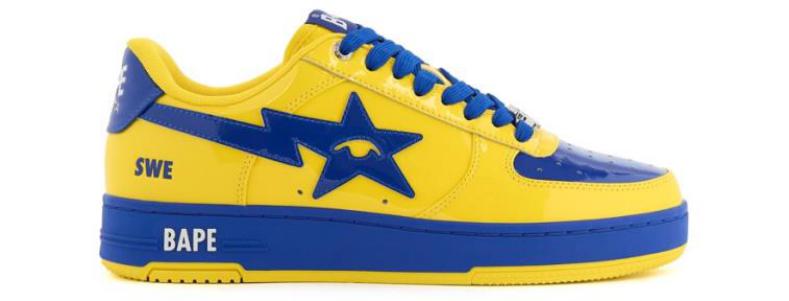
Rooted in the colours of the Swedish flag, the combination of vibrant yellow and deep blue has represented the country in international competition for generations, creating a look that is instantly identifiable. The palette itself carries a strong sense of Scandinavian design sensibility. The bright yellow delivers energy and optimism, while the blue provides balance and structure, creating a clean combination that has remained remarkably timeless throughout the evolution of football kit design. Unlike many nations that have dramatically altered their visual identity over the decades, Sweden has remained committed to a colour scheme that reflects both national pride and cultural continuity.
Did each of the six selected sneakers represent a different story, nation, or football-inspired theme, and how did those narratives influence the final designs?
The narrative always comes back to traditional kits history and how universally reconizable they can be across generations, audiences etc.
Were there any unreleased BAPESTA concepts that you felt strongly about and would still love to see brought to life one day?
ABSOLUTELY! I don’t know if this opportunity whereby it makes sense to release more World Cup colorways without recycling concepts would come up again, but I definitely think some of my unreleased designs deserve to exist. There will be more opportunities to design and fully implement my vision tho, I have no doubt about that!
Now that the pack is releasing globally, what does it mean to see your work connected to two influential names in streetwear and football culture?
It means everything! Having my concepts go into production and be available to the public – that alone is huge. But having that with Bape on SIX Bapestas is an absolute dream: one of my personal and the culture’s favorite nostalgic silhouettes and brands. I also think the whole project makes a lot of sense, with Colm’s very authentic connection to football, and the Bapesta’s perfect canvas to mimic on-field kits. This World cup feels like a particularly big cultural moment, as its partly taking place in the US, so I couldn’t have dreamt of a bigger and cooler start in my sneaker design journey!

People are increasingly recognising the creatives behind collaborations. How has your recognition changed for you since contributing to projects like this?
Having come from a ‘reselling/sourcing’ background and venturing into the actual brand, industry and culture side of the space, with ambition to work with the biggest and the best and have my name and vision associated with shoes and projects, the public’s perception is crucial. Whether that is the community, the industry, the brands. Perception is what takes you from being the guy doing cool stuff to THE guy who everybody wants to work. And projects like this cement a shift in perception and recognition, and help being taken more ‘seriously’ in the game, which in turn will bring further opportunities.
Having completed a collaboration of this scale. What would you like to try your hand at next ?
I have a lot of ideas, but in no particular order I would love to work with all the brands and products that have sparked my interest and passion since the start of my journey: Air Force 1s, Jordans, Boardflips, And1s, more Bapes. We’re coming!

